If you are not careful, a sign can be transformed into an article very quickly as you keep thinking of things you want to tell your customer. The more you try to say, the less is heard.
If your sign is too busy and cluttered, nothing will be communicated. As painful as it is to admit, remember your typical customer cares much, much less about what you have to say than you do. Keep is short and sweet.
Solution: Declutter with math
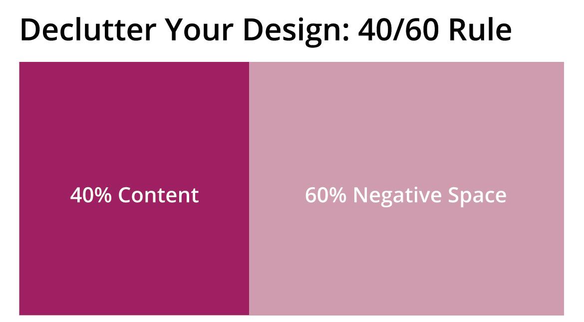
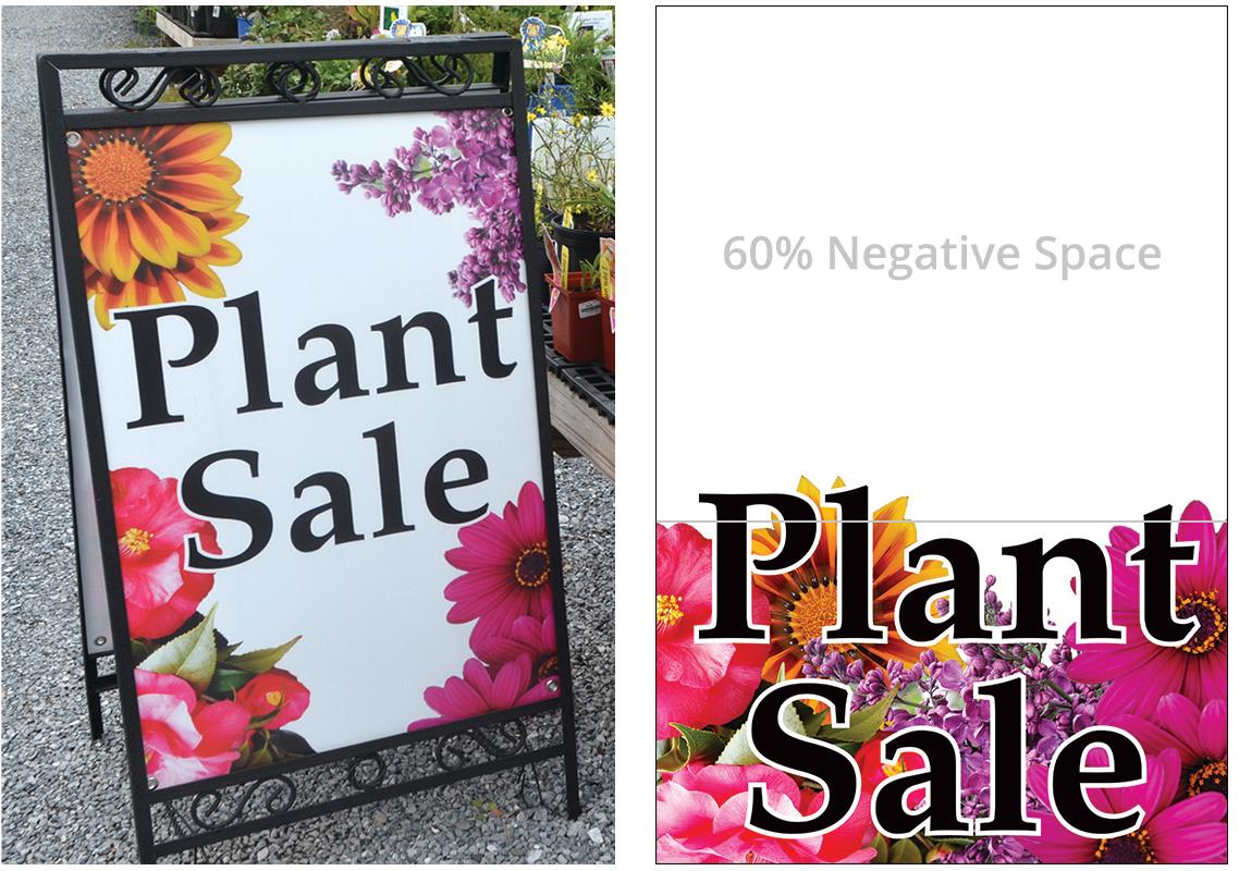
If you're verbose, use the 40/60 rule. Keep content to roughly 40 percent with 60 percent white space. Of course, there are some exceptions, but if you use appropriate font sizes and this ratio, it will help you keep your message focused and easy to read. If you shoot for 40% content, you will probably end up with closer to 50% which can still be acceptable. The example below is closer to 50/50.

